001. LETTER FROM THE EDITOR
giro Giro Tondo
Written by Lora Appleton
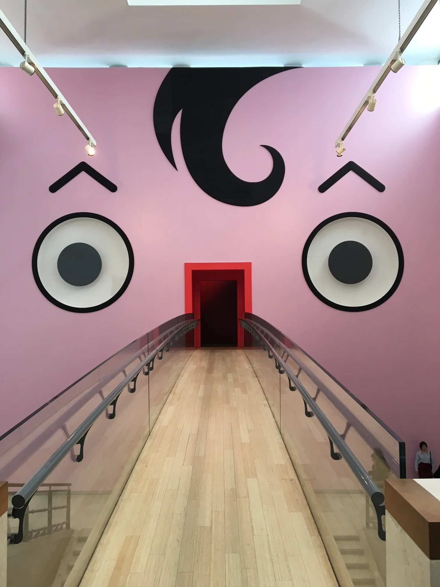
For the past three years, I’ve been lucky enough to attend the Salone di Mobile in Milan, Italy, where the best and brightest in furniture design showcase their newest and most innovative work. During this time, I’ve been thrilled to see the interest in child design grow exponentially. Both high-end designer label firms (such as Kartell, Magis, and Thonet) and prominent design studios (Nidi, Fermob, Vitra) featuring boutique children’s collections have presented incredible work. This year, the most impactful display of child design could be found at the Triennale di Milano Design Museum’s exhibition, Giro Giro Tondo Design for Children. The show had it all, beginning with a spectacular entryway designed and built by art director Stefano Giovannoni and resembling a long nose, making reference to the beloved Italian story of the wooden-puppet-turned-boy, Pinocchio.
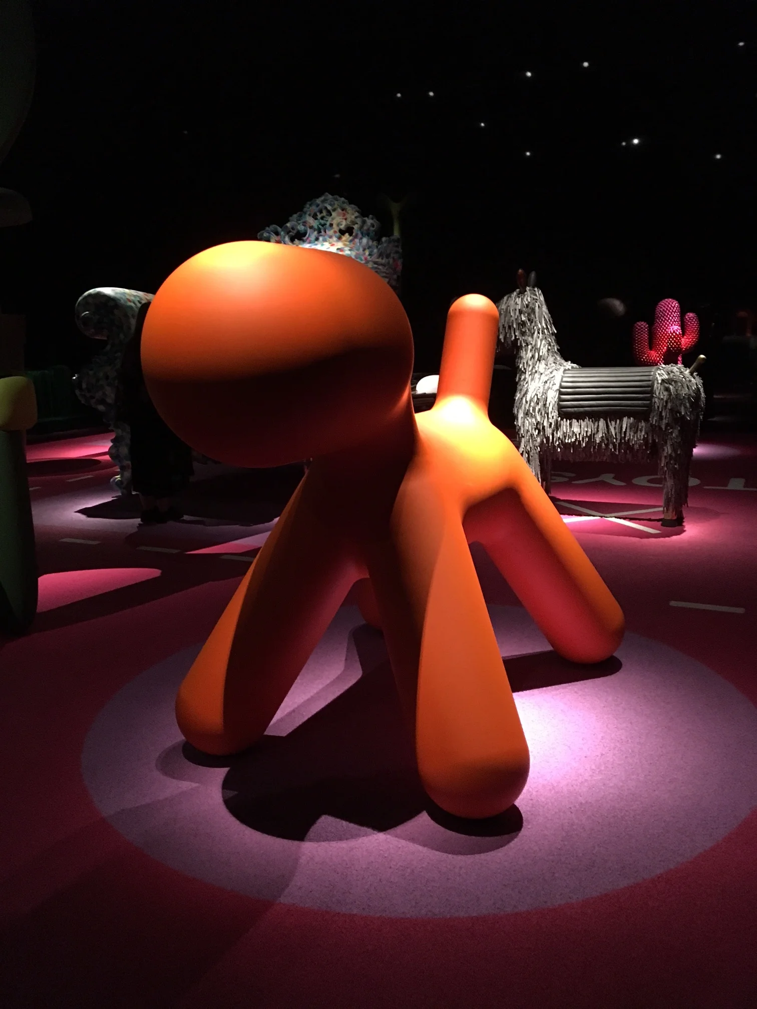
Beyond the bridge/nose, the path wound through a dark forest peppered with giant injection-molded plastic and foam creations from Gufram, Me Too by Magis, Philippe Starck, Giovannoni, and more. At this point I wasn’t sure what to expect. Would this show touch on historical design, as I thought it should? Or would it be simply a playland, as so many children’s museums and public space programs seem to be? Or would there be a clear educational angle that would completely surprise me? I was delighted to find both the historical and educational elements that are often overlooked in child design exhibitions.
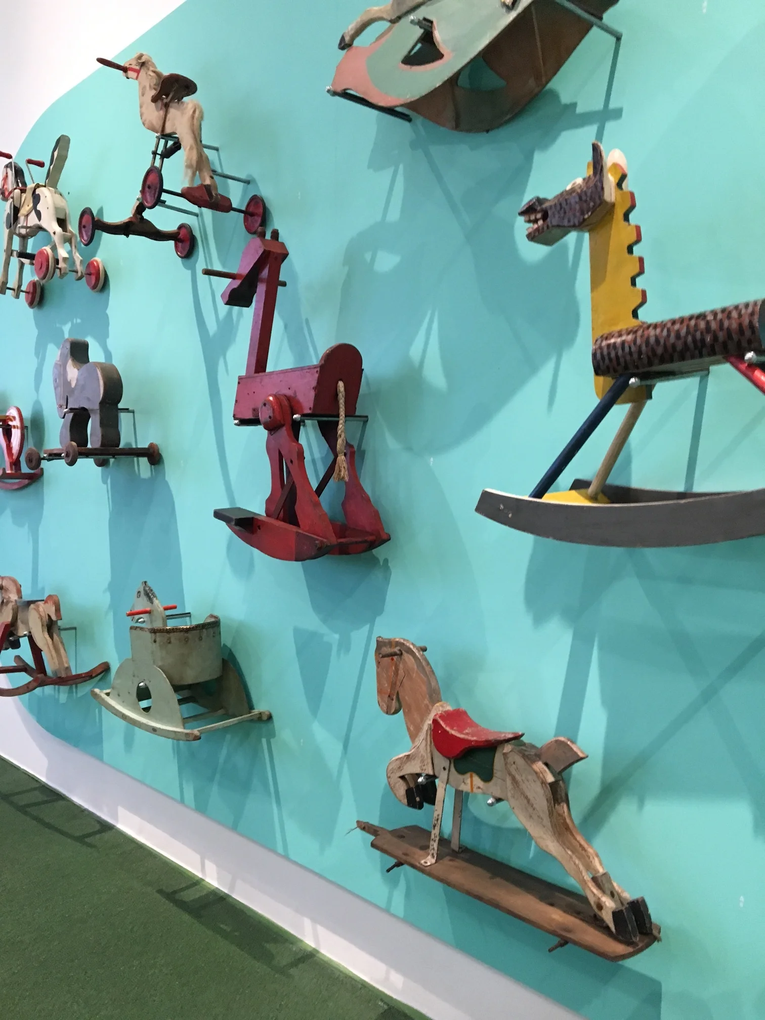
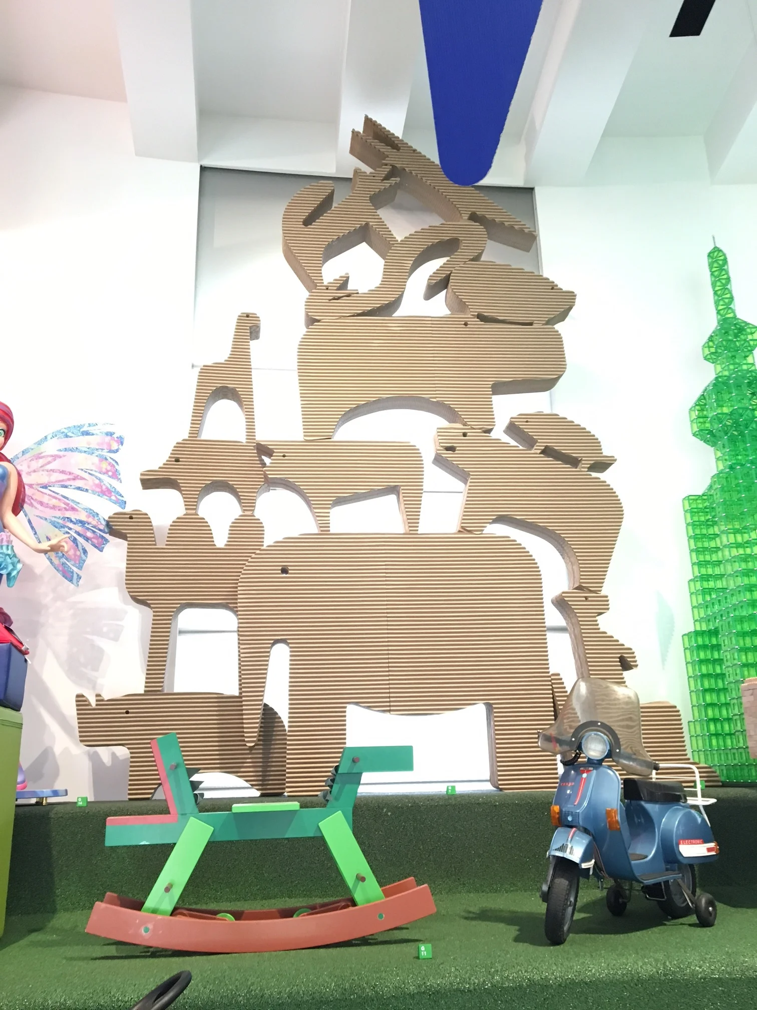
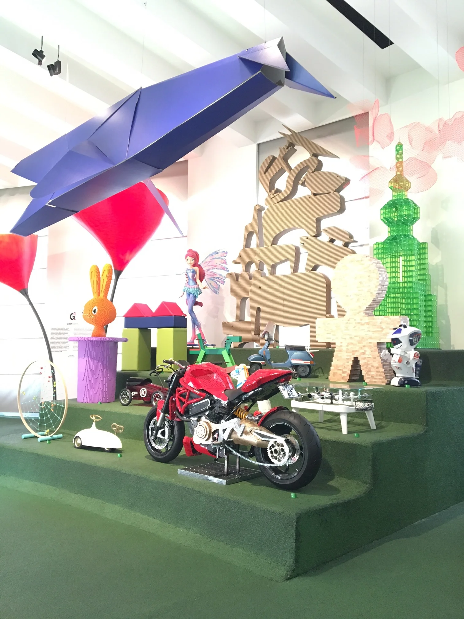
The next section of the show was pure joy for a vintage collector and design aficionado like me. Among the featured objects were historical rockers dating from as early as 1920 and highlighting traditional Cavallo a Dondolo and Poltroncina a Dondolo. There was also an amazing toy display, continuing the Pinocchio theme from the entrance. I felt immensely gratified seeing the landscape I have dedicated my career to treated respectfully and creatively, and offering so much pleasure and education to people of all ages. I loved seeing adults just as engaged as the kids.
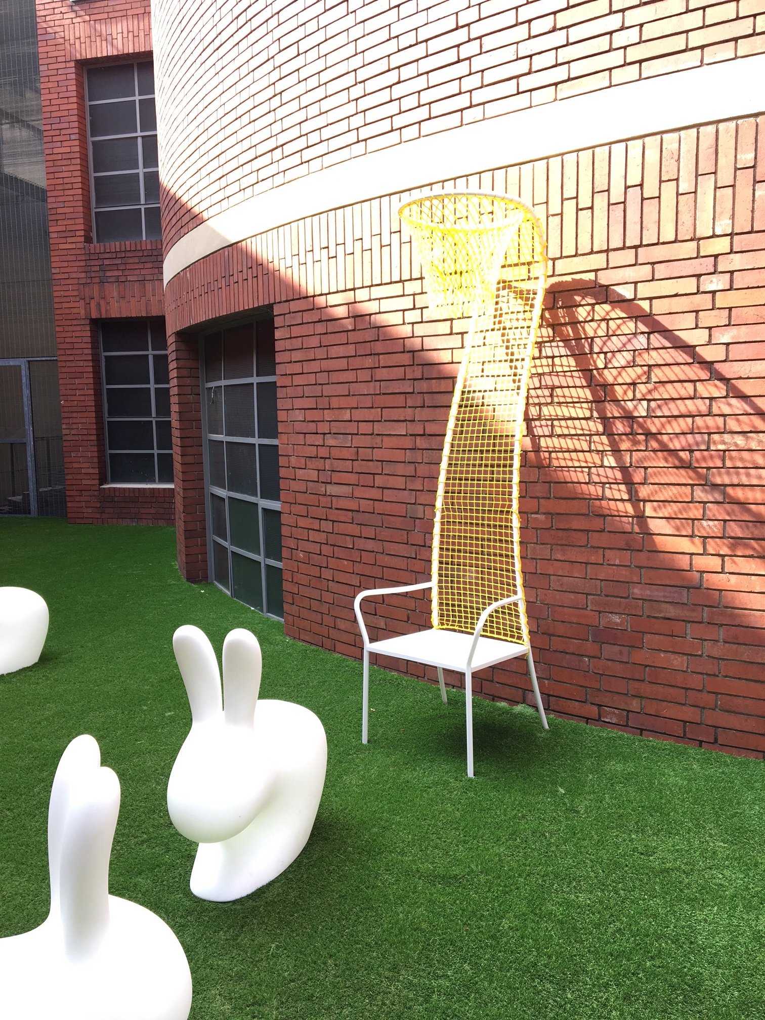
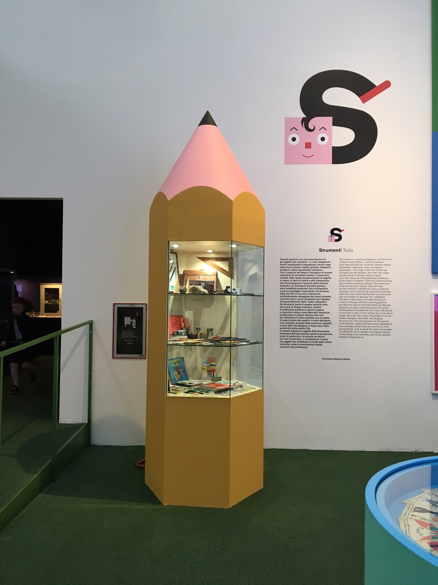
Next came a whimsical Astroturf “outdoor park” featuring more full-size plastic furniture and objects from Magis and Gufram, as well as one of my favorite art chairs by Emanuele Magini, Lazy Basketball Chair (2013). The exhibit then moved into the history of Reggio Emilia—an Italian educational program based on child-led learning—and the more familiar Montessori method, highlighting the ways in which educators have instructed and engaged children over the years. Last, but certainly not least, was an extensive section of children’s books surrounded by an exhibit of charming contemporary pencil cases and an interactive audio and face-animation display. Children's play areas closed the exhibit, engaging little ones from start to finish.
I was excited and overjoyed to see this exhibition on our often-overlooked part of the design world and was very impressed with Giovannoni’s direction and curation, perhaps the best I’ve ever seen on child design. It was comprehensive, and palatable to all ages, and I felt myself staying for hours to peruse the clever displays. We’ve only begun to explore all that can be done in this unique niche, and I’m already looking forward to what next year’s Salone will bring!
Photo by Lora Appleton.

