006. INSPIRATION
Melbourne Museum's Pauline gandel children's gallery
Written by Zachary Vigna
Children’s museum is an open-ended term. The Washington, D.C.–based Association of Children’s Museums goes no further than to venture that children’s museums are “places where children learn through play and exploration in environments designed just for them.” Operating with so few constraints, designers of children’s museums are free to be as creative as the children whose education they are tasked with supporting, to mine the worlds of education theory, architecture, design, and art as widely as safety codes will allow. The Melbourne Museum in Australia opened its Pauline Gandel Children’s Gallery in December 2016, and its design, the result of combining many voices and ideas, demonstrates that creativity breeds creativity.
Successful children’s museums include interactive environments that stimulate and maintain children’s interest. The 22 thousand square feet of the Pauline Gandel Children’s Gallery is filled with environments carefully designed with input from over six hundred teachers, artists, musicians, parents, and children with various abilities and needs to maximize stimulation and interactivity. Although open to anyone, the gallery was designed for children aged five years and younger, a demographic with an enormous range of abilities—some can run and climb, while others haven’t yet begun to crawl. One notable shared characteristic is that few of them can read, so the gallery’s environments needed to be intuitive and accessible without instructional text. Visitors who are older than five years but whose understanding of English is in any way limited will consequently feel welcome and engaged as well, a positive side effect of the gallery’s focus on such a young audience.
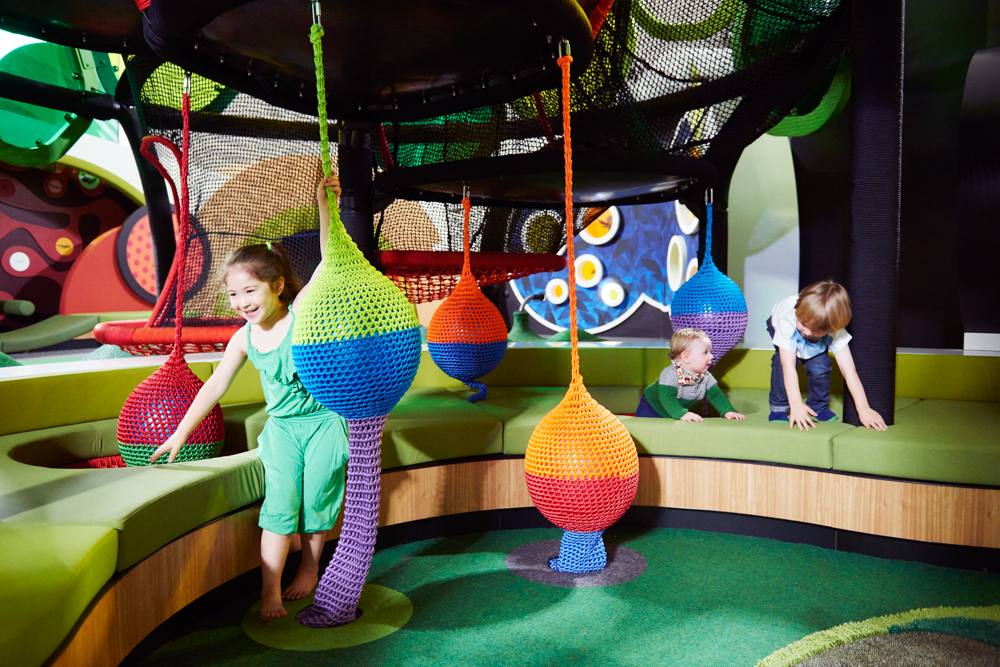
Among the environments are a one-third-scale train; a paleontological dig where children can excavate a full-size cast of a dinosaur skeleton; a “camouflage disco” featuring a “mirror wall, projections, and unique site-specific soundscapes created by three contemporary sound artists”; and several places for rest, including a “nothing nook,” to ensure that the experience never becomes overwhelming. The active elements of the gallery are multisensory—even the olfactory is not neglected—and designed to engage children’s developing pattern-recognition skills and encourage them to challenge themselves through new experiences. The desired result is that children will have a variety of learning experiences at the museum, then leave predisposed to learn more about the world around them.
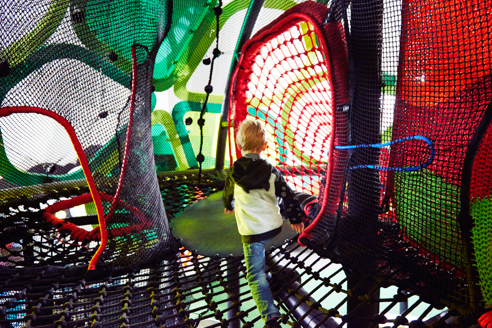
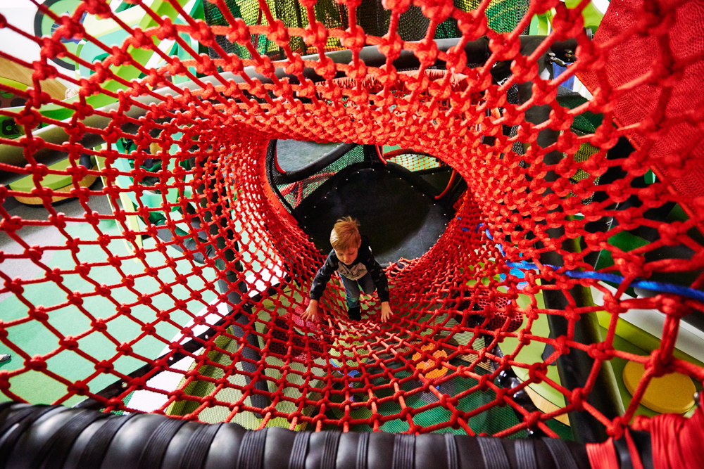
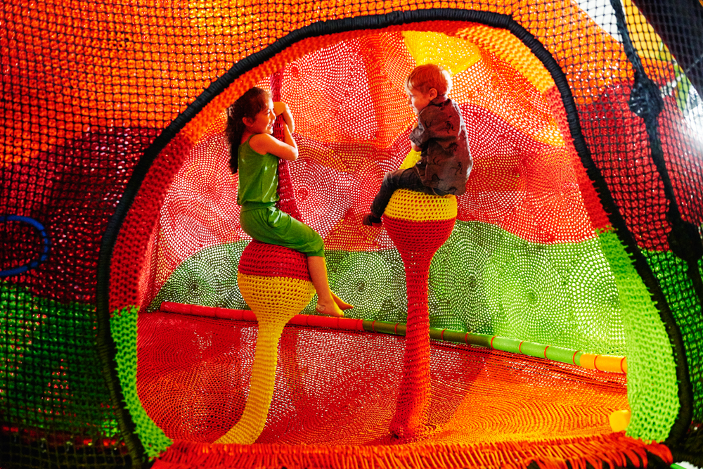
The centerpiece of the gallery is a climbing-net installation filling, as chief designer Peter Wilson describes it, “a vast skewed and angular architectural space with a sloping eight-to-fourteen-meter-high ceiling—totally disproportionate scale to our new audience, some of whom dwell mainly on the floor!” Wilson and his team “explored several design directions before settling on a multilevel internal net experience supported within a large and organic freestanding framework clad with a decorative ‘shell.’” The net, woven from brightly colored fibers and expressing many different shapes, forms its own architectural space around an internal skeleton. The installation, constructed in collaboration with Brisbane-based Urban Art Projects, is composed of several elements, including the gallery’s trademark rest spaces, but its primary purpose is to be climbed on and explored. Because the space is so large and climbers can reach such great heights, and although the installation complies with the highest safety standards, there is a perception of risk, and an opportunity for children to overcome fears in a controlled setting. In case they are not quite prepared to overcome those fears, it’s scaled to allow adult caretakers to enter and help them down, but Wilson is gratified to see that “every day kids climb down a little braver, a little older, and lot more confident.”
The installation is visually striking. Its design was influenced by Wilson’s travels with his partner and daughter, especially in Japan, where they viewed textile artist Toshiko Horiuchi MacAdam’s Woods of Net installation in the timber pavilion by Tezuka Architects at the Hakone Open-Air Museum. “Watching the sense of pure joy and delight wash over all who entered that space was an inspiration; the energy, adventure, and playful social encounters it provoked were truly enlightening and really changed my perception of what design for children could be.” Like the Melbourne Museum’s climbing net, Woods of Net is a woven structure suspended inside a large, open architectural space. The two resemble each other to a degree, and are experienced in similar ways. The greatest distinction between them is that Woods of Net is a work of art and the Melbourne Museum’s climbing-net installation is a product of design. The proximity of these two installations on the art-design spectrum is the key to the Pauline Gandel Children’s Gallery’s success.
Toshiko Horiuchi MacAdam has worked as an artist since the 1960s and was involved with the fiber art movement in the 1970s. In a 2012 interview with ArchDaily she described a transitional moment in her art production: “One day I was exhibiting a three-dimensional open-work textile sculpture I had created in collaboration with a friend. Some children came to the gallery and climbed into it. Suddenly the piece came to life. My eyes were opened. I realized I wanted just such a connection between my work and people alive at this moment in time (not a hundred years from now). I realized I was in fact making works for children.” She began a rigorous three-year study of children’s design, including visits to every playground in Tokyo, in an effort to discover the most effective ways of communicating directly with children through her art. She determined that “we need to create spaces for children to play with each other. Children learn through play, grow emotionally and imaginatively; they develop social skills, learn to cooperate, and gain wisdom about life. It is essential they use their bodies, challenge themselves, have fun, sweat, and laugh with others.”
Essentially, MacAdam independently reached within an artistic context a point of view that was already being developed within a design context in children’s museums. She even came to understand perceived danger in a way compatible with the approach Wilson took with the climbing net: “Children need to cope with risk. They enjoy a challenge but by nature are very careful. Presented with a play structure which does not challenge them, they quickly grow bored . . . and then break them.” She combined her new knowledge with her existing practice—greatly influenced by Antoni Gaudí’s organic curves—and theory to synthesize a signature artistic style that is aesthetically and functionally indistinguishable from children’s design.
All of this is present in Melbourne’s climbing-net installation. Gaudí’s curves, and the natural forms that inspired them, are visible in the net’s tunnels and weaverbird-nest shapes; MacAdam’s pursuit of the womblike is felt in the gentle rocking of the net as children climb and explore; children face and overcome fear in the absence of danger, benefiting from a burial of the boundary between the theoretical and the actual. The incorporation of art in design is an example of why the installation, and the gallery as a whole, is such a noteworthy success: the design team’s willingness to straddle lines and embrace creativity for the benefit of the children whose creativity they mean to stimulate. In my conversation with Peter Wilson, perhaps his most illuminating statement was that “once you understand a line is just as good for balancing along as dividing things, all sorts of opportunities arise.” This understanding has made the Pauline Gandel Children’s Gallery at the Melbourne Museum a success, and it points the way forward for children’s museum design.

