003. ICONS
Marcel Breuer and the Modernist Family
Written by Wava Carpenter
With the opening of the Metropolitan Museum of Art’s modern and contemporary outpost in the Breuer-designed former home of the Whitney Museum of American Art earlier this year, the work of Marcel Breuer has come back into the spotlight. Remembered mostly for concrete facades and minimalist tubular-steel furniture, the Hungarian-born architect-designer is considered a major figure of the modernist movement, and was at one time among the most celebrated and in-demand talents in both architecture and design. Throughout the more than fifty years of his career, he championed and materialized rationalist, programmatic designs as practical solutions for life in the twentieth century.
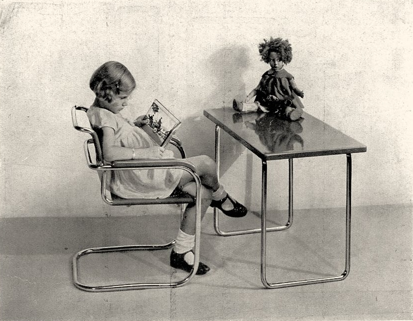
While the architect’s designs were often referred to as brutalist, his approach had a softer side. Many modernist designers defined function narrowly, but Breuer’s view on the exigencies of everyday life was wider and surprisingly sensitive, and his practice included creating children’s pieces that facilitated imagination and play.
Breuer was born in 1902 in Pécs, Austria-Hungary, not far from the current Croatian border. Interested in the arts from a young age, he received a scholarship to Vienna’s Academy of Fine Arts at eighteen. His attendance lasted only a short time, however—by some accounts, just a few hours; he recognized immediately that such a traditionally academic institution was not for him. After a friend told him about the radical pedagogy of the Bauhaus school, he bolted for Weimar to enroll. By 1924, Breuer’s precocious flair for both concept and form had earned him the admiration of the school’s founder and director, Walter Gropius, and he was appointed head of the Bauhaus’s furniture department.
The Bauhaus served as a cauldron that concentrated and melded the developing ingredients of modernist design—the primacy of function, adaptability, modularity, standardization, and mass production, alongside the rejection of the decorative, the luxurious, and the wasteful. This concoction would fuel the modernist movement well into the postwar era. Breuer, as a Bauhaus graduate and professor, carried his alma mater’s conventions into his own practice as he moved from Weimar to Paris, Dessau, Berlin, London, and finally the United States.
While Breuer applied his definitions of good design equally across his work (the forms did not vary much between his designs for adults and children), his principles of portability and adaptability were particularly relevant in relation to his views on childhood. A father of two children, Breuer was deeply influenced by the Bauhaus’s synthesis and elaboration of the theories of child-development advocates such as Friedrich Froebel, Ellen Key, Maria Montessori, and Rudolf Steiner, all of whom promoted the stimulation of learning in children through creative, hands-on play, including lots of outdoor time exploring the natural world. Further, many Bauhaus proponents held that what was good for children was also good for adults—meaning that adults should endeavor to retain the spirit of exuberant inquisitiveness and experimentation that comes so naturally to children. With this in mind, Breuer ensured that his designs for children could be easily manipulated to perform ever-changing functions. For example, a shelf could be pushed over to become a ladder, then covered with blankets to make a fort.
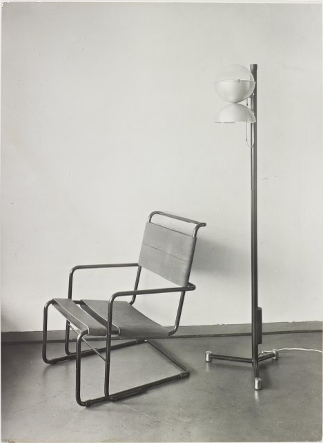
Breuer’s iconic stature in design history was cemented by one of his earliest successes. Inspired by the curved yet sturdy handlebars of his childhood bicycle, he developed some of the world’s first furniture designs in bent tubular steel while teaching at the Bauhaus in 1925. The famous Wassily chair was the earliest iteration of his idea, but he quickly followed up with a variety of tubular-steel chairs, tables, and desks, including pint-size versions for children.
For Breuer and his fellow modernists, tubular steel had limitless potential with respect to a number of their goals. It was lightweight and strong, and furniture made from it was easy to move and clean, allowing for adaptable and hygienic interiors—particularly appropriate for children’s spaces. Though it was not yet fully possible in the 1920s, in principle the material could be produced inexpensively in large-scale factories, which would keep it affordable for most segments of society.
Breuer’s thinking about the way children live didn’t end with his furniture designs. Within his architectural practice—which realized more than seventy designs for private residences over the course of his career—Breuer developed the concept of the “binuclear” house specifically to accommodate family life. The most public demonstration of this formulation was the 1949 installation in the garden at the Museum of Modern Art of a model home that Breuer planned for a middle-class American family. In 1950, it was rebuilt on a Rockefeller estate in Westchester County, New York, where it still stands today.
Partitioning the private from the public, the noisy from the quiet, and the active from the calm lies at the heart of Breuer’s binuclear house concept. In the MoMA house this approach meant the spaces dedicated to adults and children were positioned at opposite ends of the structure—a product of the postwar view of a father’s limited role in his children’s upbringing. “You want to live with the children,” Breuer is attributed as having said, “but you also want to be free from them, and they want to be free from you.”
Breuer’s MoMA house incorporated a range of pleasant design solutions for children and caretakers. The playroom, for instance, was located away from the living room and was filled with stackable foam seating and large hollow blocks designed by Frank Caplan and Martha New that could be used for both storage and building. A small window in one wall linked the playroom to the kitchen so that a parent (the mother, presumably) could check in every now and then. The layout of the home was adaptable and meant to evolve over time. For instance, the “children’s” side of the house contained two bedrooms, one of which could be occupied by the parents when the children were very young. Of course, as in all good modernist home design, there were ample windows throughout the entire house, serving to blur the distinction between outside and inside and connect the family to the surrounding natural environment.
According to a 1949 Breuer catalog published by Architectural Record, the beauty of the binuclear house plan lies in its clean organization, its simplicity of management, and its creation of zones of privacy. For a small family without outside help, the plan has many conveniences: Only the daytime wing needs to be kept in presentable condition, while the bedroom/playroom element can safely become the necessarily chaotic domain of children; furthermore, the connecting link forms an excellent sound baffle between the parents’ rest and work space and the children's realm of self-expression.
In response to the Met Breuer’s opening, design critics, arts publications, and newspapers are heralding the return of brutalism and Bauhaus architecture. But for the daily lives of parents and their children, Breuer’s appeal weathered the trends of the latter half of the last century. His utilitarian design and rational layout of family homes proved a winning combination for the modernist household, and continue to influence child design today.


